Add 'AND' display format to Attribute filter dropdown #1309
Conversation
 Aljullu
added
status: needs review
type: enhancement
Aljullu
added
status: needs review
type: enhancement
|
So to clarify (going by by the gif alone), is It's quite possible this is a limitation of attribute term queries for Woo that I'm not aware of |
Aljullu
changed the base branch from
add/attributefilter-dropdown-display
to
master
Aljullu
force-pushed
the
add/attributefilter-dropdown-and-display
branch
from
1d43a7f to
b1ceb67
Compare
@nerrad that's to keep feature-parity with the current widgets. But I would love to do research at some point and see if this can be improved so instead of tying up the dropdown style to the Query Type, we add another attribute to allow single/multiple select. So you could have an Is that something we might want to pursue in the short-term? I would create an issue if that's the case. For reference: p6riRB-4CG-p2. |
I think we should consider it. While I appreciate at a minimum reaching feature parity with existing widgets, I also think we have an opportunity to introduce new enhancements that make the blocks more appealing over existing widgets (which can potentially help with adoption). So for clarity, I see the following query options:
I don't know if such queries are even feasible with the Woo data model, so the issue should explore that as well. All of the above can be copied into the issue. This particular pull then is concerned with item 2 (I'll review from that context). |
Actually, if we only allow single selection, it doesn't matter if it's I also wonder if we should allow the List display style with single selection. We could implement it with |
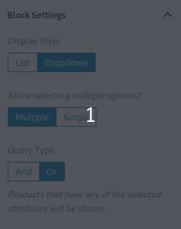
I think it does. OR is always multiple selection. However "AND" could be either single or multiple depending on how the selections apply to the final query eg. And: "Blue AND Yellow" Or: "Blue OR Yellow". So one way of doing it would be to flip the controls around so that if they select AND, there is a Single or Multiple controls. If it's "OR" then no single/multiple control. Should we move this specific convo to a new issue though or were you thinking of just getting it done in this pull (which I'd be fine with assuming it won't take too much more time and the resulting query is okay to do server side). |
 nerrad
left a comment
nerrad
left a comment
nerrad
left a comment
There was a problem hiding this comment.
Just a few comments, but otherwise looking good. I've reviewed this assuming we would merge as is and continue the conversation about multiple selections for an AND query type in a separate issue. Obviously things will change if you decide to implement that in this pull.
| const stateReducer = ( state, changes ) => { | ||
| switch ( changes.type ) { | ||
| case Downshift.stateChangeTypes.keyDownEnter: | ||
| case Downshift.stateChangeTypes.clickItem: | ||
| return { | ||
| ...changes, | ||
| highlightedIndex: state.highlightedIndex, | ||
| isOpen: multiple, | ||
| inputValue: '', | ||
| }; | ||
| case Downshift.stateChangeTypes.blurInput: | ||
| case Downshift.stateChangeTypes.mouseUp: | ||
| return { | ||
| ...changes, | ||
| inputValue: state.inputValue, | ||
| }; | ||
| default: | ||
| return changes; |
There was a problem hiding this comment.
One of those times where I wish we had performance measuring tools to know whether we should wrap this in useCallback (memoized on the multiple prop). I'm on the fence. Being this is a reducer passed through to Downshift, and in particular the wrapping component, I think there's value in wrapping this in useCallback here. Especially since parent components in a tree using this component are likely to re-render (filters due to attribute count changes?)
There was a problem hiding this comment.
Converting it to useCallback makes sense, I did the change in 9c7c8c0.
| queryType: blockAttributes.queryType, | ||
| }, | ||
| queryState, | ||
| queryState: filterAvailableFilters ? queryState : null, |
There was a problem hiding this comment.
I'm having trouble grokking the purpose of this. Can you explain why this was needed?
There was a problem hiding this comment.
This is used for the List display style with the AND query type, so filters that would display 0 results are hidden:
In 27eea78, I updated the logic so available filters are only filtered in the case I said (style: List and query: AND).
| filterAddedName, | ||
| filterRemovedName | ||
| ), | ||
| 'assertive' |
There was a problem hiding this comment.
From this doc it seems like this should be 'polite' not assertive. What rationale is being used for using 'assertive' here?
There was a problem hiding this comment.
My goal was so it announces the filter change before announcing the current focused button. But it doesn't seem to work anyway, so removing it: f2f3c7c.
| speak( | ||
| sprintf( | ||
| __( | ||
| '%s filter replaced with %s.', |
There was a problem hiding this comment.
Would be good to add translator comment here maybe?
| } else if ( filterAddedName ) { | ||
| speak( | ||
| sprintf( | ||
| __( '%s filter added.', 'woo-gutenberg-products-block' ), |
There was a problem hiding this comment.
Same here, should we add translator comments? "filter" could potentially have different meanings in different contexts.
| const checkedOption = displayedOptions.find( | ||
| ( option ) => option.value === checkedValue | ||
| ); | ||
| const onChange = ( replace ) => ( checkedValue ) => { |
There was a problem hiding this comment.
There's a lot happening here. I'd still wrap (checkedValue) => { /**/ } in a useCallback.
I would prefer to do it in a follow-up (I usually prefer to keep PRs small). I created an issue here: #1311 and added some feedback to your last comment. |
Aljullu
force-pushed
the
add/attributefilter-dropdown-and-display
branch
2 times, most recently
from
14e93b2 to
27eea78
Compare
|
Thanks for the review @nerrad. This is ready for another look! |
 mikejolley
left a comment
mikejolley
left a comment
mikejolley
left a comment
There was a problem hiding this comment.
Thanks for tackling this @Aljullu !
Some feedback on how it works.
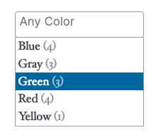
- The 'and' dropdown has no placeholder/default text which looks broken.
- Can we populate/select some default values in the editor too?
- The styles are off in 2019 theme, I didn't try others. But after selecting, there were weird highlights and the text wasn't visible.
- There are no pointer styles when selecting an item, but there are once an item is selected.
Whilst this works, the dropdown component itself feels unfinished currently.
I wonder how many people actually find dropdown useful vs the list which has limiting in place now (core doesn't limit options, but blocks limits to 10 with an expand link)... @nerrad also had feedback around single vs multiple selection, but that is something possible with list mode already.
Aljullu
force-pushed
the
add/attributefilter-dropdown-and-display
branch
from
27eea78 to
90a1297
Compare
|
Thanks for the review @mikejolley! I addressed most of your feedback and answered your comments below.
Good point! I thought that was per-design, but looking at the widgets, they both have a placeholder, so I fixed it in 807f7b2.
In general, isn't it a better practice to display the block as it will be shown in the frontend? There are some cases where that's not possible (Active Filters or the Cart block, for example), but when it is possible I would prefer not to pre-fill it. I think it might be confusing for users that the select box has a value by default in the editor while it shows a placeholder in the frontend.
Right, I added fixes for 2016, 2017, 2019 and 2020 in this commit: 90a1297.
I'm not sure I understood you. I added
What do you mean by that? Is that a design consideration or are you missing some functionality?
In a store with many terms for one attribute, having an input field where you can write the term name is probably more practical than having to search the value in a long list, no? |
Now there is a placeholder it's not as important.
Select boxes usually use
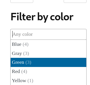
Yes design/styling. This is what I'm seeing:
To me it's lacking some polish, and it's not clear this is actually a dropdown just looking at it. It can be improved in follow ups, but I think it needs work before going into a stable release.
Good point, that is useful. Changes look good 👍 |
I tried to mimic the styles from p6riRB-4CG-p2, if we want to change/improve them I think it would be better to do that in a follow-up so we don't block this PR. 🙂
What theme and browser are you using? I did another round of testing with three browsers and five themes and did some more tweaking (5d6cdea) but I'm always unsure what should be left to the theme to style and what should be forced to follow our own styles. |
2019, firefox.
Hmm I think for inputs we should reset theme styles and apply as much as possible ourselves so as to match other form elements as best as we can. Like the range slider; that's not left for themes because it's an input. Themes can of course changes styles if they want to. |
For me it's looking much better (it might be related to the last changes I did):
There was an issue with the label misaligned in Firefox with Twenty Twenty, I filled the issue there and hopefully it will be fixed in the next point release (there is already a patch): https://core.trac.wordpress.org/ticket/48876
Makes sense. Currently, only the |
|
Thanks, I think this is good to go now and anything else can be resolved with follow-ups after feedback. |
nerrad
left a comment
nerrad
left a comment
There was a problem hiding this comment.
lgtm too. Agreed with Mike, followups can happen as necessary post merge.
Fixes #1134.
Fixes #1135.
Follow-up of #1255.
Accessibility
Screenshots
How to test the changes in this Pull Request:
Dropdownand the Query Type toAND.OR.