-
Notifications
You must be signed in to change notification settings - Fork 97
feat(datepickers): introduce DatepickerRange component #397
New issue
Have a question about this project? Sign up for a free GitHub account to open an issue and contact its maintainers and the community.
By clicking “Sign up for GitHub”, you agree to our terms of service and privacy statement. We’ll occasionally send you account related emails.
Already on GitHub? Sign in to your account
Conversation
 jzempel
left a comment
There was a problem hiding this comment.
Choose a reason for hiding this comment
The reason will be displayed to describe this comment to others. Learn more.
The interaction between the ranged date picker and the associated start/end inputs feels off to me. It's strange that if I'm focused in the end field that the start date would reset by clicking a new end date. If I fat-finger the end date by one (for example), I want to be able to easily adjust by clicking a new end date. The user interaction feels like the date range should adjust whichever field has focus. I'm sure there are 1k edge cases that make whatever I'm saying super complicated.
@ginnywood and I sat down and re-worked some of the focus strategy for this interaction. The component now alternates selection based on previous selection. It now also allows |
There was a problem hiding this comment.
Choose a reason for hiding this comment
The reason will be displayed to describe this comment to others. Learn more.
|
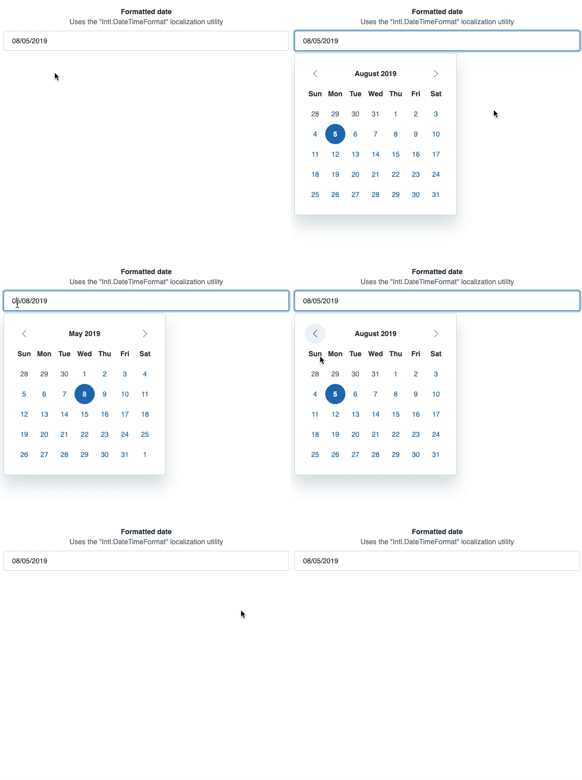
I noticed a weird bug while testing the custom format example, but it turns out you're just missing the What happens for me as it tries to switch to my locale on close which is dd/mm/yyyy but the example sets the initial |


Description
This PR introduces the
DatepickerRangecomponent. To allow for additional flexibility in input and calendar placement, this component uses the following API:This type of composition allows consumers to determine which type of inputs will be used and how they can be laid out. In the provided example I use our
react-formsandreact-gridcomponents for the dynamic layout.Detail
Checklist
designer as a reviewer)
💅 view component styling is based on a Garden CSScomponent
yarn start)