adding ugly delivery states for chat #14616
Conversation
Jenkins Builds
|
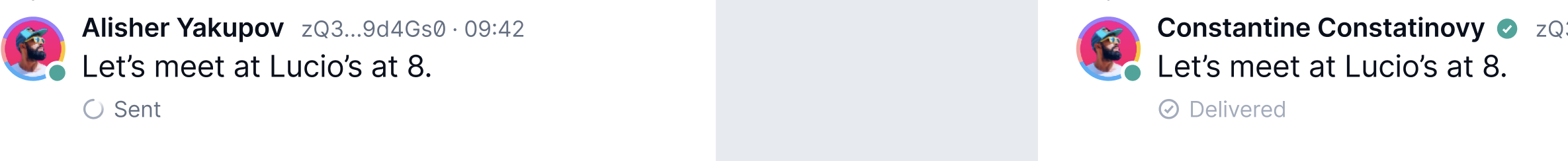
Delivery states are as follows :
- Sending (all messages begin with sending state)
- Sent (They are sent if they have left the device)
- Received (They are received once the receiver has acknowledged the message)
 siddarthkay
force-pushed
the
14588-add-message-delivery-states
branch
from
siddarthkay
force-pushed
the
14588-add-message-delivery-states
branch
from
6edc395 to
d07f623
Compare
|
mhm. two concerns,
|
|
|
|
actually we had them , just lost them when we switched from quo to quo2 icons, we just need to fix icon's names , i can do it in my PR actually |
|
@flexsurfer we had a discussion with designers and we raised some issues with their implementation
The solution we agreed with the design team, is to make them as ugly as possible, so it's 100% clear, that they are not part of the design ( I believe sid talked to John/received some feedback from John already) So for point 1, they want them as ugly as possible :) |
that's very weird, our app for dogfooding will be 10% of the new design, and it's already ugly, because old UI is broken, so at least we could receive feedback from users on "new" statuses they are already implemented with no cost |
the ones in the design? Those we know they are bad though, the feedback last time was very clear (when we had a spinner that disappeared), users didn't like it at all, since when offline you get a bunch of spinners/Sending..., which looked like you had to do something, also they are technically incorrect, since I think in this case there are too many fundamental issues (for example it would show all messages as delivered if the last one has been delivered, even if some of them weren't) and user feedback is not going to help so much, since they could easily miss it |
but what's the point then to have ugly icons if they are useless? i mean functionality will be the same with fundamental issues + ugly icons , why not have fundamental issues +temporary "normal" icons or labels , so the idea to hide ugly icons meaning from the user to not confuse them? what's the point then ? :) sorry that i started this discussion, i know it is simpler to just merge this PR :) |
but ugly icons doesn't solve this right ? |
|
they do, we have separate icons (dots) for the delivery states, (obviously
not the final form), why do you think they don't? is the concern that users
won't understand what it means?
…On Thu, 22 Dec 2022, 08:18 flexsurfer, ***@***.***> wrote:
As a user
I want to know if my message has been sent/delivered
So that I understand if the other recipient has read my message
but ugly icons doesn't solve this right ?
—
Reply to this email directly, view it on GitHub
<#14616 (comment)>,
or unsubscribe
<https://github.com/notifications/unsubscribe-auth/AAHYJMH6NQQZM2BCSNJWKRDWOQFG5ANCNFSM6AAAAAATGNAJAE>
.
You are receiving this because your review was requested.Message ID:
***@***.***>
|
100% they won't understand, why don't just use labels then if we want them to understand? |
|
i am happy with anything myself, we have two requirements:
1) they are correct, unlike the designs, so each message has its own
correct status
2) they must look ugly (from the design team) and not something that looks
like a potential implementation
anything that fullfills both, i am ok with, if we want to go for labels,
sure, up to us
…On Thu, 22 Dec 2022, 08:39 flexsurfer, ***@***.***> wrote:
they do, we have separate icons (dots) for the delivery states, (obviously
not the final form), why do you think they don't? is the concern that users
won't understand what it means?
… <#m_608137795204055608_>
On Thu, 22 Dec 2022, 08:18 flexsurfer, *@*.*> wrote: As a user I want to
know if my message has been sent/delivered So that I understand if the
other recipient has read my message but ugly icons doesn't solve this right
? — Reply to this email directly, view it on GitHub <#14616 (comment)
<#14616 (comment)>>,
or unsubscribe
https://github.com/notifications/unsubscribe-auth/AAHYJMH6NQQZM2BCSNJWKRDWOQFG5ANCNFSM6AAAAAATGNAJAE
<https://github.com/notifications/unsubscribe-auth/AAHYJMH6NQQZM2BCSNJWKRDWOQFG5ANCNFSM6AAAAAATGNAJAE>
. You are receiving this because your review was requested.Message ID: @.*
>
100% they won't understand, why don't just use labels then if we want them
to understand?
—
Reply to this email directly, view it on GitHub
<#14616 (comment)>,
or unsubscribe
<https://github.com/notifications/unsubscribe-auth/AAHYJMHBIICD6BK4MNOGNS3WOQHUBANCNFSM6AAAAAATGNAJAE>
.
You are receiving this because your review was requested.Message ID:
***@***.***>
|
|
sid, would you please discuss/agree with flexsurfer on something that we
are all happy with and that requires minimum effort and we can change it
On Thu, 22 Dec 2022, 08:42 Andrea Maria Piana, ***@***.***>
wrote:
… i am happy with anything myself, we have two requirements:
1) they are correct, unlike the designs, so each message has its own
correct status
2) they must look ugly (from the design team) and not something that looks
like a potential implementation
anything that fullfills both, i am ok with, if we want to go for labels,
sure, up to us
On Thu, 22 Dec 2022, 08:39 flexsurfer, ***@***.***> wrote:
> they do, we have separate icons (dots) for the delivery states,
> (obviously not the final form), why do you think they don't? is the concern
> that users won't understand what it means?
> … <#m_4797429428712594887_m_608137795204055608_>
> On Thu, 22 Dec 2022, 08:18 flexsurfer, *@*.*> wrote: As a user I want to
> know if my message has been sent/delivered So that I understand if the
> other recipient has read my message but ugly icons doesn't solve this right
> ? — Reply to this email directly, view it on GitHub <#14616 (comment)
> <#14616 (comment)>>,
> or unsubscribe
> https://github.com/notifications/unsubscribe-auth/AAHYJMH6NQQZM2BCSNJWKRDWOQFG5ANCNFSM6AAAAAATGNAJAE
> <https://github.com/notifications/unsubscribe-auth/AAHYJMH6NQQZM2BCSNJWKRDWOQFG5ANCNFSM6AAAAAATGNAJAE>
> . You are receiving this because your review was requested.Message ID: @.*
> >
>
> 100% they won't understand, why don't just use labels then if we want
> them to understand?
>
> —
> Reply to this email directly, view it on GitHub
> <#14616 (comment)>,
> or unsubscribe
> <https://github.com/notifications/unsubscribe-auth/AAHYJMHBIICD6BK4MNOGNS3WOQHUBANCNFSM6AAAAAATGNAJAE>
> .
> You are receiving this because your review was requested.Message ID:
> ***@***.***>
>
|
|
yes, please, labels are simpler implement for devs, and understand for users ,but im not sure i understand what does mean correct ?
if we just replace these icons by labels will it be correct? like sending/sent/delivered |
|
btw if they want we could even add some extra info like |
|
Labels do make it clearer and is a very little effort at the moment "(it's better for it to be very obviously ugly, so nobody could ever confuse it for being the actual design, and we dont' forget to replace the ugly thing with the actual design when the actual design is ready)" I will check in with John as well because I had looped him into the earlier versions of the ugly delivery states @flexsurfer I will also wait till your messaging restructuring PR gets in so that I can make changes in the right place. |
|
|
btw in general because we'll have many old components in the app for dogfooding, we could make a general solution. like make a border for views with old components, it will be definitely ugly and visible |
|
did this in my PR |
|
@flexsurfer : |
|
|
 ilmotta
left a comment
ilmotta
left a comment
ilmotta
left a comment
There was a problem hiding this comment.
I'm a bit late to the party, but I agree with @flexsurfer. I'm approving the PR, but only because there's already been a decision about how things should look.
IMO, next time we shouldn't accept the arguments in favor of creating very ugly things on purpose.
"(it's better for it to be very obviously ugly, so nobody could ever confuse it for being the actual design, and we dont' forget to replace the ugly thing with the actual design when the actual design is ready)
This line of reasoning doesn't make much sense to me.
- We won't forget to replace the ugly thing with the actual design if we create an issue on Github and manage it appropriately. It does look more like a reminder to designers because they might forget if we don't put ugly stuff in the app. This is wrong.
- The mobile app will be in a state of flux, with some ugly things or incomplete things for a long time. All users using the new app will notice this during the next handful of months, but making some things ugly on purpose doesn't help, it only makes things worse in terms of user experience.
|
Agree here with @flexsurfer and @ilmotta , better to have a label with WIP state like #14616 (comment) than some icons that everybody will ask about, as they are unclear. There is no way we forget about changing it, as it looks incomplete and ofc as @ilmotta said there will be an issue to manage it. |
|
@cammellos @flexsurfer I'm off today, but jumping in quickly here. We have two choices:
We should definitely NOT be landing any UI that isn't designed but isn't very obviously a placeholder. Nobody is using our app other than ourselves ATM, landing obvious placeholder UI makes it obvious to any other Status internal stakeholders who install the app that what they are seeing is a placeholder, not the indented design. If folks are unhappy with landing this functionality with very obviously placeholder UI (e.g. the video that @siddarthkay posted at the top of this thread) then we should not land this functionality until the final designs are designed and implemented. tldr; the options here are options 1) and 2), we should definitely NOT land this functionality with any UI that isn't a very obvious placeholder. And by very obvious, I means something exactly like @siddarthkay posted at the top of this thread. |
|
btw, I'm more than happy to discuss why doing things this way is so important at our next call |
|
yeah that was my plan, to implement screens from scratch, but i was told that we should keep the old UI, so if we are doing this with status component we should do similar with others, so in that case I'm for removing them |
|
@siddarthkay red label as @flexsurfer did is good enough, this discussion has gone for long enough and that's a reasonable compromise between the parties, I can explain to @John-44 and I am sure he'll be fine with it. Would you mind changing it please and apologies for the ping-pong. @ilmotta Have a word with the design team if you wish, but the reason is also not to influence future implementations as well. Just to give a longer explanation: Currently the major issue is that there's no delivery states, that is frustrating for the users (we know that from user feedback), very difficult to debug any potential issue and 95% of the value is in giving the users delivery states that are visible. We know that because that's user feedback we received in the past. The designs produced had the same issues that we know from user feedback, so we pushed back on those and pushed to have delivery states in RC, their condition is that they look ugly in order not to influence the design and to make sure it's clear it's not a final design. To provide the best value for the user, we should all familiarize ourselves with what delivery states are, how are they used, what they mean and their limitations, so we can catch these issues in the future, spread understanding of them , that will give us the tool to help the designers come up with the best way to surface this to users. Thanks everyone for their input and suggestions. |
|
@John-44 we will go for #14616 (comment) this addresses both concerns, very clear to users that is a WIP and clear on what it means in terms of delivery states. |
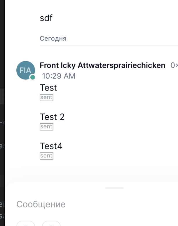
@cammellos in that case, could somebody change "sent [WIP]" in blue to "[SENT - PLACEHOLDER TO BE REMOVED]" in red? It should be really f*****g obvious (pardon the language). |
|
@cammellos just updated my comment above - should be "[SENT - PLACEHOLDER TO BE REMOVED]" in red |
|
sure 😃
…On Thu, 22 Dec 2022, 11:09 John__, ***@***.***> wrote:
[image: image]
<https://user-images.githubusercontent.com/11790366/209110907-ab01c772-9289-456c-b4d2-288903e19d82.png>
@John-44 <https://github.com/John-44> we will go for #14616 (comment)
<#14616 (comment)>
this addresses both concerns, very clear to users that is a WIP and clear
on what it means in terms of delivery states.
@cammellos <https://github.com/cammellos> in that case, could somebody
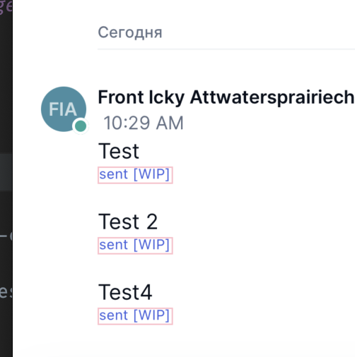
change "sent [WIP]" in blue to "sent [PLACEHOLDER TO BE REMOVED]" in red?
It should be really f*****g obvious (pardon the language).
—
Reply to this email directly, view it on GitHub
<#14616 (comment)>,
or unsubscribe
<https://github.com/notifications/unsubscribe-auth/AAHYJMEDPGZTEZR42XZUMOTWOQZG3ANCNFSM6AAAAAATGNAJAE>
.
You are receiving this because you were mentioned.Message ID:
***@***.***>
|
|
all our obvious placeholders should be in red, it makes them more obvious |
Thanks! :-) |
|
sorry, does that mean the entire app will be perfectly implemented with the new design and only message statuses will be temporary for dogfooding? asking for a friend |
it will be not possible to use messages screen in that case |
|
we will have delivery states in the final version of the designs, but they
are most likely not going to be ready for rc, the placeholder will be
replaced with delivery states once ready
…On Thu, 22 Dec 2022, 11:16 flexsurfer, ***@***.***> wrote:
sorry, does that mean the entire app will be perfectly implemented with
the new design and only message statuses will be temporary for dogfooding?
asking for a friend
—
Reply to this email directly, view it on GitHub
<#14616 (comment)>,
or unsubscribe
<https://github.com/notifications/unsubscribe-auth/AAHYJMDQYHFUEZGY7MVRGODWOQ2BJANCNFSM6AAAAAATGNAJAE>
.
You are receiving this because you were mentioned.Message ID:
***@***.***>
|
No, we should be using this same technique (red placeholders) in any places where we are currently missing elements of the new design. e.g. where we don't yet have the correct illustration to (for example) indicate an empty state, we should have a big red square where the final illustration will go (instead of using a wrong illustration as a placeholder). This is a general rule that should apply everywhere; all UI in the dogfooding app should either be:
What we really don't want is any UI that doesn't fall into one of these three categories. |
Then we should just go back to the dots that @siddarthkay posted at the very top of the thread. The fact that this is temp placeholder UI needs to be very very obvious. I don't think "sent [WIP]" is sufficiently obvious to an internal stakeholder who has no context of this conversation. Better to fail very obviously! Soft failing is bad |
@cammellos, I'm definitely in agreement about your points. Nobody is asking for something perfect now. The value is not in the design at this point 👍 The point I raised is that IMO we have better ways to manage the project than adding ugly things as reminders. My mindset is: "do something as simple as possible, but not necessarily ugly on purpose". Sometimes putting effort on making things scream imperfection is more effort than making something simple in the first place, as we can see in this PR's discussion. But I'm not the one managing the project, so I'm fine overall. It's okay to have healthy disagreement.
@John-44, I think this is the first time the mobile team is hearing about your strategy. We'll make sure to communicate this to the rest of the team. IMO, it also looks like the design team should also update things in Figma with red borders, etc, otherwise it's hard for engineers to precisely know what's not pixel perfection, and we also end up in discussions having to design something ugly ourselves (engineers). It would help engineering not drift from Figma if Figma also had the ugly hints. What do you think, should they update Figma as well? |
Yes I fully agree this should apply to the Figma designs as well. Think about how many times there has been questions about illustration where a designer has responded with "oh, that illustration is just a placeholder". A little bit of everybody's time could have been saved multiple times if the figma's had really obvious red box placeholders (in figma's sent to dev) where illustrations were missing. @pedro-et something to discuss when we are back from xmas holidays. We are a large team now, so following standards like "if it's not a final design, it should be a very obvious red placeholder", and things like all placeholders consistently being red, will help us manage and improve design and UI implementation quality. Although something can seem like an obvious placeholder to the people who are directly working on it, the fact that something is intended as just a placeholder really isn't obvious to people that weren't involved in the discussion, unless work is put in to make it super super obvious that a placeholder is in fact a placeholder. Again another case in point is placeholder illustrations in figmas - the designers thought it would be obvious to any dev looking at a figma that a placeholder illustration was a placeholder illustration, but we know that this isn't the case. So yes, what I'm saying here fully applies to Figma designs as well as the implementation :-) Doing this (making all placeholders red and very very obvious) saves us time (e.g. without anybody needing to say anything, everybody will know (for example) what UI implementation needs further finessing, and what UI can be ignored for now because it's just placeholder. If makes it easer if we say "All UI (other than the very obvious red placeholders) needs to be near px perfect" and "any UI in Figmas that's just a red square or red all caps text doesn't need to be finessed in the implementation", etc, etc... |
|
The danger zone that we want to avoid at all costs is having placeholder UI that isn't really super 'hit you in the face obvious' that it is placeholder UI. Hence why all placeholder UI should be red, text in all caps, make it as obvious as possible, etc... |
|
@ilmotta I never mentioned this is something that we will use as a way to
manage things, it's the first instance of this happening, so we don't need
yet to make a decision about how to handle these things in future.
All I care is that the users have delivery state for RC, in whatever shape
or form that is helpful.
Any other placeholder that we will have to add to the app can be discussed
as a one off basis.
@flexsurfer @john let's just agree on some text, I can't imagine we can't
find a compromise between the two, nor that it's worth our time.
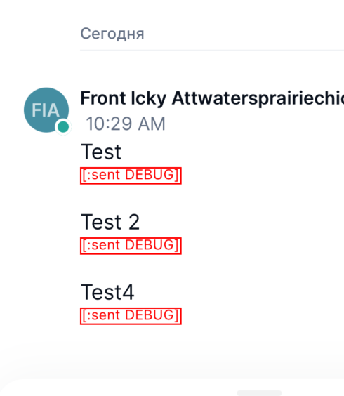
[Sent DEBUG] should be clear.
On Thu, 22 Dec 2022, 11:36 Icaro Motta, ***@***.***> wrote:
@siddarthkay <https://github.com/siddarthkay> red label as @flexsurfer
<https://github.com/flexsurfer> did is good enough, this discussion has
gone for long enough and that's a reasonable compromise between the
parties, I can explain to @John-44 <https://github.com/John-44> and I am
sure he'll be fine with it. Would you mind changing it please and apologies
for the ping-pong.
@ilmotta <https://github.com/ilmotta> Have a word with the design team if
you wish, but the reason is also not to influence future implementations as
well. To me is a reasonable compromise and provides most of the value to
users (delivery states) for RC (I'd rather have something functional, than
pretty, I don't care much about pretty until the product is functional) at
the lowest development cost.
Just to give a longer explanation:
Currently the major issue is that there's no delivery states, that is
frustrating for the users (we know that from user feedback), very difficult
to debug any potential issue and 95% of the value is in giving the users
delivery states that are visible. Making them pretty is 5% of the value
(numbers of course are up in the air, but that's one of the few things were
user feedback was clear in the old app, they screamed for delivery states,
while feedback about them being annoying was much less prominent), and
spending any time in making it pretty for then a week later having to
redesign them has little value in my opinion (the argument is not that
"they need to be perfect", the argument is that what is in the design is
non-functional, so it's a broken implementation).
We know that because that's user feedback we received in the past. The
designs produced had the same issues that we know from user feedback, so we
pushed back on those and pushed to have delivery states in RC, their
condition is that they look ugly in order not to influence the design and
to make sure it's clear it's not a final design.
To provide the best value for the user, we should all familiarize
ourselves with what delivery states are, how are they used, what they mean
and their limitations, so we can catch these issues in the future, spread
understanding of them , that will give us the tool to help the designers
come up with the best way to surface this to users.
Thanks everyone for their input and suggestions.
@cammellos <https://github.com/cammellos>, I'm definitely in agreement
about your points. Nobody is asking for something perfect now. The value is
not in the design at this point 👍
The point I raised is that IMO we have better ways to manage the project
than adding ugly things as reminders. My mindset is: "do something as
simple as possible, but not necessarily ugly on purpose". Sometimes putting
effort on making things scream imperfection is more effort than making
something simple in the first place, as we can see in this PR's discussion.
But I'm not the one managing the project, so I'm fine overall. It's okay to
have healthy disagreement.
This is a general rule that should apply everywhere; all UI in the
dogfooding app should either be:
1. the new designs implemented to beautiful 'near px perfect' quality
2. red placeholders that make it very very obvious where any new
design elements are missing
3. old UI that we haven't worked on yet.
What we really don't want is any UI that doesn't fall into one of these
three categories.
@John-44 <https://github.com/John-44>, I think this is the first time the
mobile team is hearing about your strategy. We'll make sure to communicate
this to the rest of the team. IMO, it also looks like the design team
should also update things in Figma with red borders, etc, otherwise it's
hard for engineers to precisely know what's not pixel perfection, and we
also end up in discussions having to design something ugly ourselves
(engineers). It would help engineering not drift from Figma if Figma also
had the ugly hints. What do you think, should they update Figma as well?
—
Reply to this email directly, view it on GitHub
<#14616 (comment)>,
or unsubscribe
<https://github.com/notifications/unsubscribe-auth/AAHYJMGGC6J4JDI7W5BHUHTWOQ4MXANCNFSM6AAAAAATGNAJAE>
.
You are receiving this because you were mentioned.Message ID:
***@***.***>
@cammellos could we go with "[SENT DEBUG]" in red? I think it would be good if we established standards for placeholder UI so that it's consistently really really obvious that placeholder UI is in fact placeholder UI, and also so we don't need to have this discussion again in the future ;-)
I would like to propose that all placeholder UI (in both figma's and in implementation) is:
- Red
- In the case of an illustration, is represented by a red square
- in the case of text, is represented by the text being red, being all caps, and stating that it's either for a debug mode, or a placeholder to be removed, or something that explicitly says that it is not part of the design.
- A general principle that whenever a designer or a developer needs to insert some form of placeholder, that placeholder should be in red and as maximally obvious that it's a placeholder as possible.
WDYT?
With these rules, "[SENT DEBUG]" in red would work
|
|
|
|
looks good to me, we can talk about how to handle placeholders in the
future, in a separate discussion if the issue crops up again and there's a
need to find a generic solution, but Sent DEBUG in red is what we go for in
this instance.
thanks everyone
…On Thu, 22 Dec 2022, 12:09 flexsurfer, ***@***.***> wrote:
[image: image]
<https://user-images.githubusercontent.com/11790366/209131402-44d5c8c4-a66d-4c6a-ad95-90b70446c9da.png>
—
Reply to this email directly, view it on GitHub
<#14616 (comment)>,
or unsubscribe
<https://github.com/notifications/unsubscribe-auth/AAHYJMCD3GJMGBXKXFHA6BDWORAFZANCNFSM6AAAAAATGNAJAE>
.
You are receiving this because you were mentioned.Message ID:
***@***.***>
|
|
Super thanks, nobody (including somebody who has zero context of this conversation) will mistake that for being anything other than a placeholder, which is exactly what we want in any placeholder :-) And the designers will be super motivated to design a nice solution soon to replace that placeholder, and UI devs will be super motivated to implement the nice designed solution to get rid of the placeholder ;-) And we won't find ourselves explaining in repeated conversations that "this element is actually a placeholder" (because it will just be really obvious to everyone). And there will be no risk of key internal stakeholders looking at it and thinking "that's a bit ugly" but not saying anything, because it will be obvious to them that it's a placeholder. |
|
Since this will be implemented in @flexsurfer 's PR I am closing this PR! |
7 participants
Delivery states are as follows :
fixes #14588
Platforms
Functional
Steps to test
screen recording
Screen.Recording.2022-12-22.at.12.45.12.PM.mov
status: ready
ps : I've been told to make this red & ugly :)