A11y: Use PyData Theme's Sphinx Design Components to fix dark mode contrast #61
Conversation
|
hey @hugovk !! 👋 welcome to pyOpenSci!! MANY thanks for this pr. it's much more readable and accessible without that class so let's merge this. |
|
@all-contributors please add @hugovk for code, review |
|
I've put up a pull request to add @hugovk! 🎉 |
|
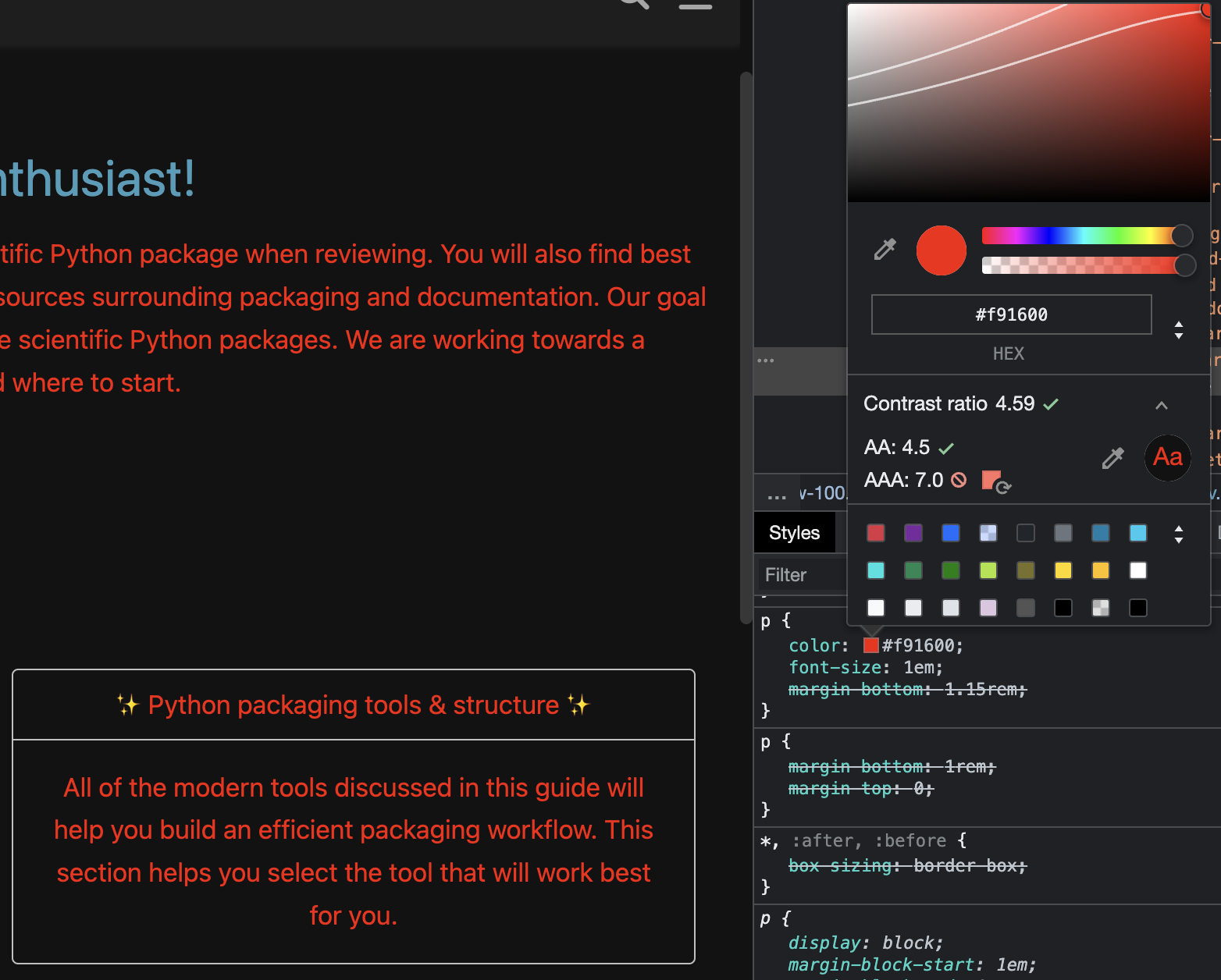
may i ask - what tool are you using to evaluate contrast ratio in the screenshots above? |
|
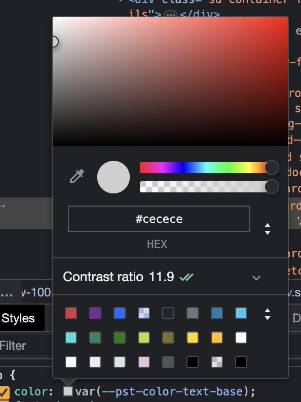
I used Chrome's devtools. For example, right click an element and select Inspect. Then find the relevant bit of text in the HTML and find the
Click the little coloured square to open the colour picker:
And the down arrow:
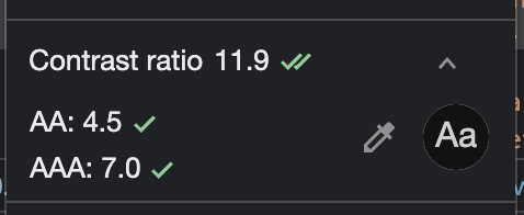
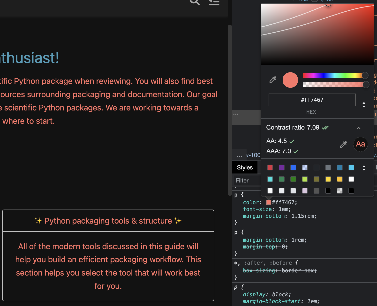
Here all is now good. Assuming it wasn't, you can use the colour picker to try different colours and it updates the page and contrast results:
You can also click the little circular arrow next to "AA 4.5" and "AAA 7.0" to get suggested colours. AA:
And AAA:
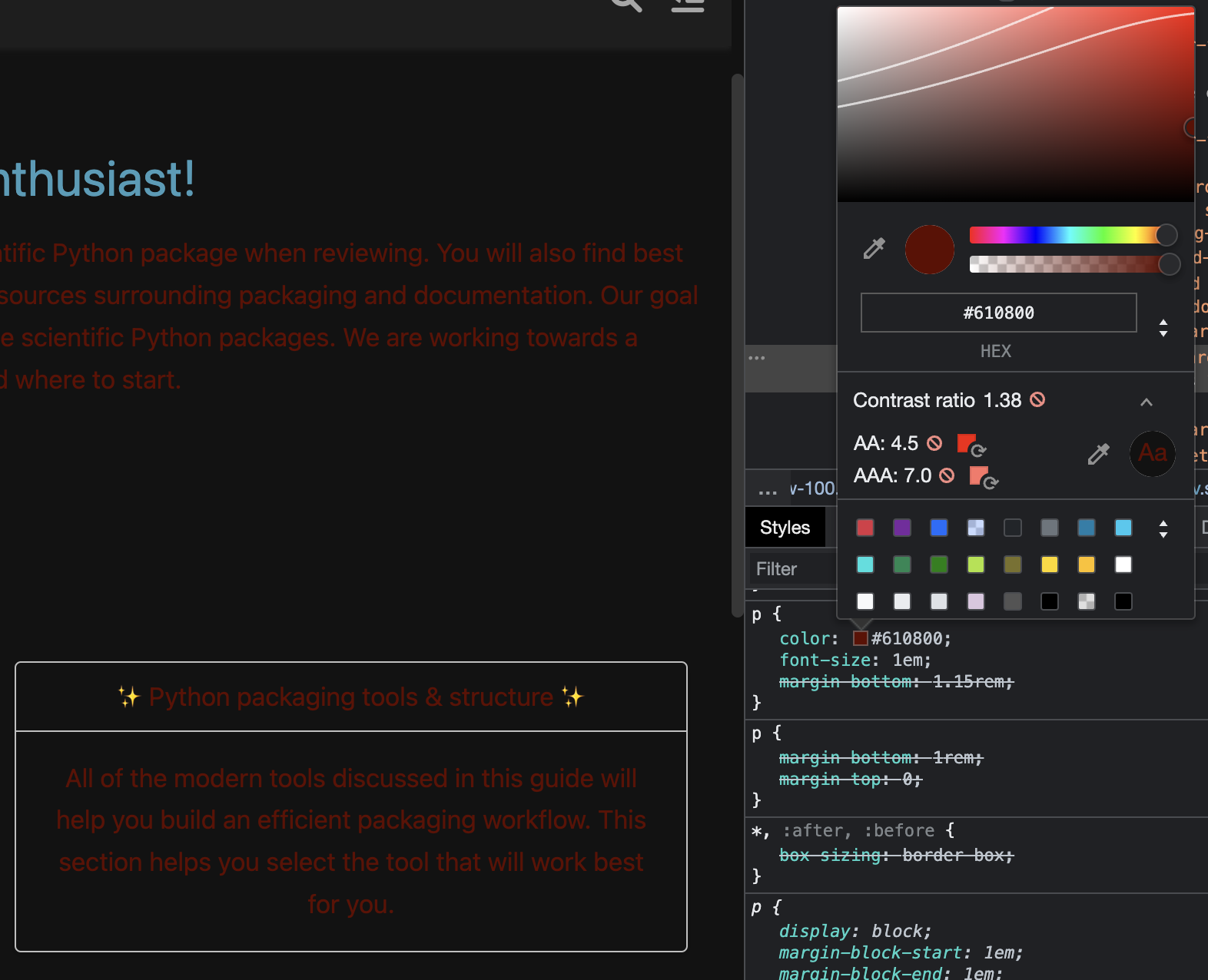
That was a bit of an artificial example. I also suggest checking AAA, but sometimes the suggested colour is a bit too far from the original. |
|
Good to know, thanks so much @hugovk. We definitely want the site to be accessible in every way. |
|
Another tip is to run the accessibility audit in Google's Lighthouse either from Chrome's devtools (which allows testing both light and dark mode) or online at https://pagespeed.web.dev/, for example: https://pagespeed.web.dev/analysis/https-www-pyopensci-org-python-package-guide/1r3w5g4oc7?form_factor=mobile That highlights another contrast issue for teal with white, plus missing link name for the GitHub badge. |
|
Wow this is all so helpful. Thank u so much, hugo!!
I've been using the Firefox dev tools as I never fully could figure out the
chrome ones. Looks like I should dig into some other tools!! Many thanks
for the tips!!
I've also been thinking about moving away from this theme as it seems to
have a few other responsive issues at particular widths w the nav bar.
This whole area of accessibility and usability across devices is so darn
tricky but incredibly important!
|
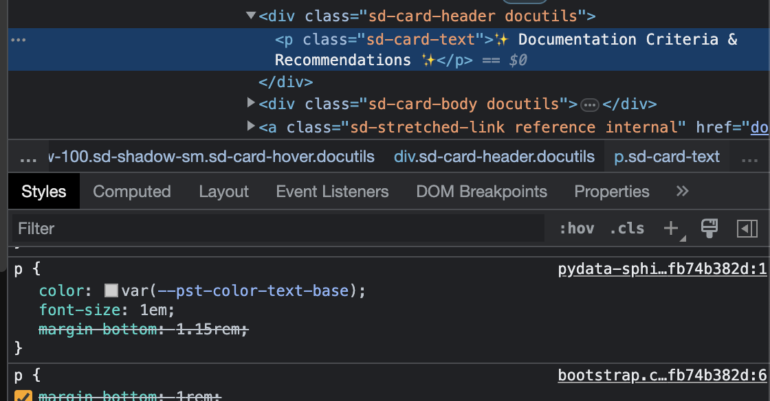
In light mode, the card titles at https://www.pyopensci.org/python-package-guide/ has dark grey text on a light grey background:
The contrast is good, meeting both of WCAG's AA and AAA accessibility guidelines:
However, in dark mode, we get a light grey text on a light grey background, making it hard to read:
It has very low contrast, meeting neither level:
In both cases, we're using Bootstrap's
bg-lightclass for the background.One fix would be to use a darker background in dark mode.
But the cards at https://pydata-sphinx-theme.readthedocs.io/en/latest/user_guide/web-components.html#cards don't have any special background colour for the panel titles, so shall we follow suit?
If so, we get this:
And: