Skip to content
Merged
Show file tree
Hide file tree
Changes from 2 commits
Commits
File filter

Filter by extension

Filter by extension

Conversations
Failed to load comments.
Loading
Jump to
Jump to file
Failed to load files.
Loading
Diff view
Diff view
5 changes: 5 additions & 0 deletions .changeset/clever-waves-think.md
Original file line number Diff line number Diff line change
@@ -0,0 +1,5 @@
---
"@primer/primitives": minor
---

Add SegmentedControl colors
17 changes: 16 additions & 1 deletion data/colors/vars/component_dark.ts
Original file line number Diff line number Diff line change
Expand Up @@ -186,5 +186,20 @@ export default {
bg: get('scale.blue.5'),
disabledBg: get('scale.gray.5'),
}
}
},

segmentedControl: {
bg: get('scale.gray.8'),
hoverBg: get('scale.gray.6'),

active: {
bg: get('scale.gray.7'),
border: get('scale.gray.6'),
},

pressed: {
bg: get('scale.gray.6'),
border: get('scale.gray.4'),
},
},
}
17 changes: 16 additions & 1 deletion data/colors/vars/component_light.ts
Original file line number Diff line number Diff line change
Expand Up @@ -187,5 +187,20 @@ export default {
bg: get('scale.blue.5'),
disabledBg: get('scale.gray.5'),
}
}
},

segmentedControl: {
bg: get('scale.gray.1'),
hoverBg: get('neutral.muted'),
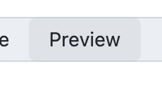
Copy link
Contributor

Choose a reason for hiding this comment

The reason will be displayed to describe this comment to others. Learn more.

As I've been working on the React implementation of segmented controls (PR), I changed the design to make the :hover and :active states lighter.

I haven't solved the design for all color modes yet, but here's what I have so far: https://github.com/primer/react/pull/2108/files#diff-feb85d0e75c6e6596e095632632ccc668254e56b60a7bffb4189736358e96222R40-R46

Copy link
Contributor Author

Choose a reason for hiding this comment

The reason will be displayed to describe this comment to others. Learn more.

Currently this PR is using:

  • hover: alpha(get('scale.gray.3'), 0.2)
  • active: alpha(get('scale.gray.3'), 0.4) which is double of hover.

It should already be lighter than in Figma and keeps it in the same tone (gray hue) as neutral.muted

:hover :active
Screen Shot 2022-06-04 at 17 07 32 Screen Shot 2022-06-04 at 17 08 22

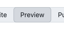
Also, I added a border for :active to give it some sort of "inset" look when pressed.

Copy link
Contributor Author

Choose a reason for hiding this comment

The reason will be displayed to describe this comment to others. Learn more.

I kept the colors, but now it uses an "inset style":

2022-07-20 16 28 58


active: {
bg: alpha(get('scale.gray.3'), 0.4),
border: get('scale.gray.3'),
},

pressed: {
bg: get('canvas.subtle'),
border: get('scale.gray.4'),
},
},
}