Bell icon in navigation #678
Conversation
…icator. Removes flag icon.
| background-color: @notification-badge-color; | ||
| border-radius: 20px; | ||
| border:1px solid @navbar-pf-bg-color; //improves visibilty at smaller size | ||
| color: @navbar-pf-vertical-active-color; |
There was a problem hiding this comment.
Using a vertical-nav related variables for the horizotal nav seems strange. What color is this, white?
There was a problem hiding this comment.
ah yes that isn't right. Missed that when I copied it over from the vertical implementation. It is white yes.
There was a problem hiding this comment.
Why the border on the badge for horizontal nav but not for vertical nav? I see it says for visibility at smaller sizes but I think it may help for the vertical navbar size as well.
|
The badge color looks OK to me, @andresgalante But I will defer to @kybaker on that. The only other thing is that the representation of other items in the masthead is inconsistent between the two examples. Can we make these both consistent with http://www.patternfly.org/pattern-library/application-framework/masthead/#/design ? The vertical example is close but should add user name. |
|
@mcarrano maybe @matthewcarleton needs more guidance, Can you be more specific about exactly you'd like to see? |
|
@mcarrano @andresgalante Ok I can add the username for the vertical example. |
|
Yes, the Veritcal Nav example should include the user name. In the Horizontal example, the label "Status" should not be there (text labels in the masthead are not defined). I would replace that with the help menu as it is in the vertical example. So when were done, both examples should be identical except for the sizing. |
|
@mcarrano ok, makes sense I will do that. |
|
I've updated the pages to reflect all the same icons. For the Nav page I've removed the status and added the help dropdown. Also changed the general navigation pages to not include the notification icon/drawer. |
 mcarrano
left a comment
mcarrano
left a comment
There was a problem hiding this comment.
Looks great @matthewcarleton ! I'm good to merge.
|
@kybaker the "help" icon looks fuzzy on a non retina screen, is that ok? |
 jeff-phillips-18
left a comment
jeff-phillips-18
left a comment
There was a problem hiding this comment.
LGTM, one question below but I'm OK either way.
| background-color: @notification-badge-color; | ||
| border-radius: 20px; | ||
| border:1px solid @navbar-pf-bg-color; //improves visibilty at smaller size | ||
| color: @navbar-pf-vertical-active-color; |
There was a problem hiding this comment.
Why the border on the badge for horizontal nav but not for vertical nav? I see it says for visibility at smaller sizes but I think it may help for the vertical navbar size as well.
|
@jeff-phillips-18 I did implement it on the larger version (vertical nav) but didn't find it necessary. |
|
@matthewcarleton I was wondering why the black border as well. I don't think @jeff-phillips-18 had the border at all in his implementations. @jennyhaines thoughts on this from the visuals side? |
|
@matthewcarleton @beanh66 - I think the 1px border looks nice when it matches with the background color. This would mean that by default, the border color is #030303 ... on hover, the border color is #232323 ... and while active, the border color should be #363636 . If this is too much, I would think that scrapping the border would be fine, though it does look nicer with the border, in my opinion. It would be good to have consistency in the border treatment between both horizontal and vertical implementations. |
|
Hi @jennyhaines , #363636 is not part of our color pallet: We should stick to colors from the color pallet so we can use less variables and keep consistency. |
|
FWIW, I was recently trying to match colors in the masthead and navigation and there are a bunch of variables defined as lightening other colors, resulting in colors that aren't defined in the palette. I saw #171717, #232323, and #363636 and there are actually over 25 variables for the navbar that are defining lightened colors. |
|
@jennyhaines thanks for that catch :) I've updated the :hover, :active states and added the border to the vertical nav icon as well. I've used the variables that were being used to avoid the possibility of adding new colours. |
|
@matthewcarleton - The updates look great! Thanks! |
|
@matthewcarleton Is this all set then? |
|
@jeff-phillips-18 yeap, done 👍 @matthewcarleton thanks a lot! |
Description
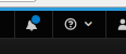
adds bell icon to vertical and horizontal navigation, with circle indicator. Removes flag icon.
In order to show the empty badge this requires a space, otherwise add a value
Here is the url for the horizontal navigation ( you'll notice the 1px border to increase visibility at a smaller size :) ):
https://rawgit.com/matthewcarleton/patternfly/notification-drawer-dist/dist/tests/notification-drawer-horizontal-nav.html
Here is the url for the vertical navigation:
https://rawgit.com/matthewcarleton/patternfly/notification-drawer-dist/dist/tests/notification-drawer-vertical-nav.html
Todos
@andresgalante @srambach @jgiardino Can you please please review this please :)