[ML] Anomaly charts for metric detector should plot min, mean or max as appropriate #65078
Description
The metric function combines min, max, and mean functions. Anomalies charts for detectors which use this metric function, should plot the chart data using the min, mean, or max aggregation as appropriate corresponding to the anomaly that is being displayed.
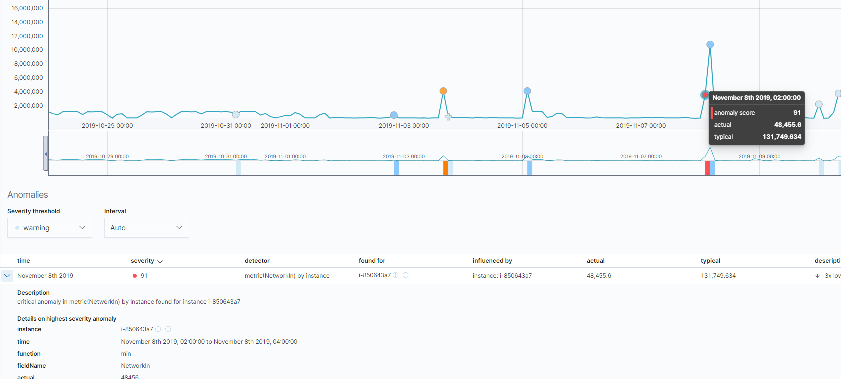
Currently the chart always plots mean, which can give misleading results. For example, here the highest scoring (red) anomaly is in the min function, but the Anomaly Explorer chart plots mean, with the actual value of the anomaly not corresponding to the y-value shown in the chart:
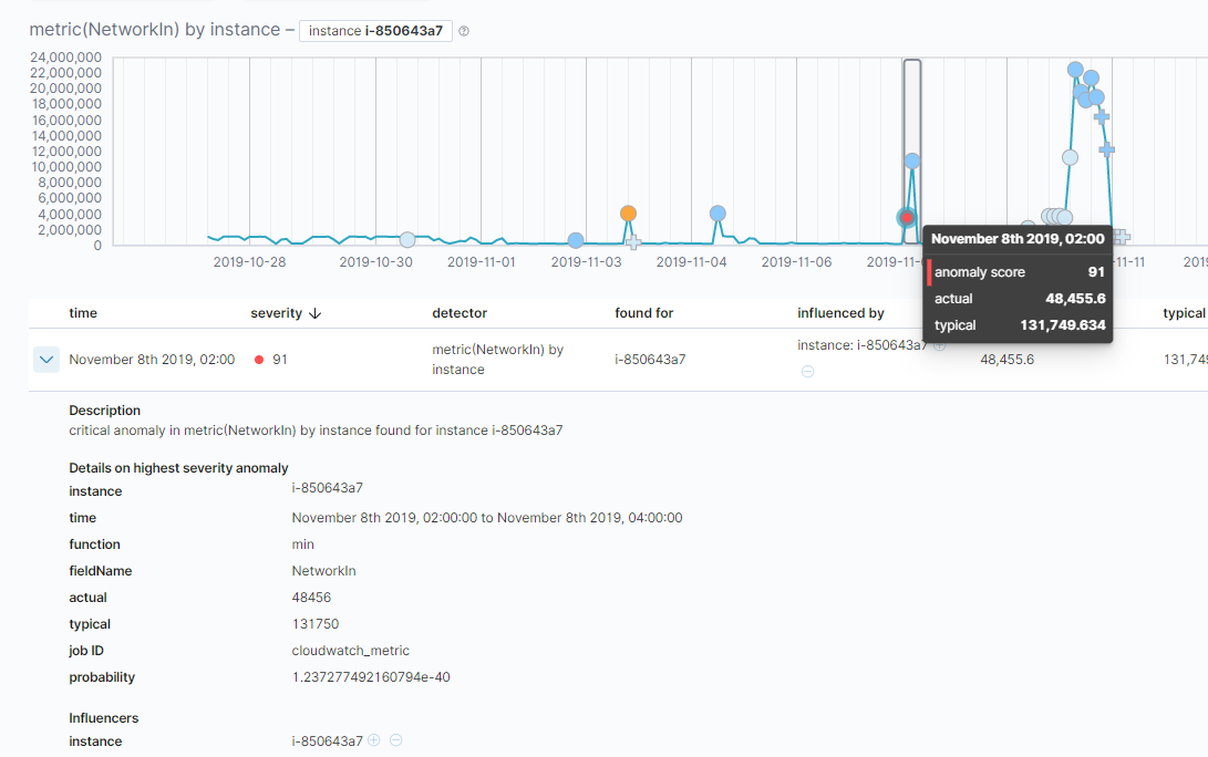
Similarly on drilling down to the Single Metric Viewer, the chart is again plotted using mean: