Code block(s) is/are hard to read in tutorial. I suggest this simple change. #171
Description
Point-of-view: I am currently going through the "Using Bind Mounts" section, and in one of the code blocks I find that the highlighted-text is too hard to read on the eyes.
i.e.:
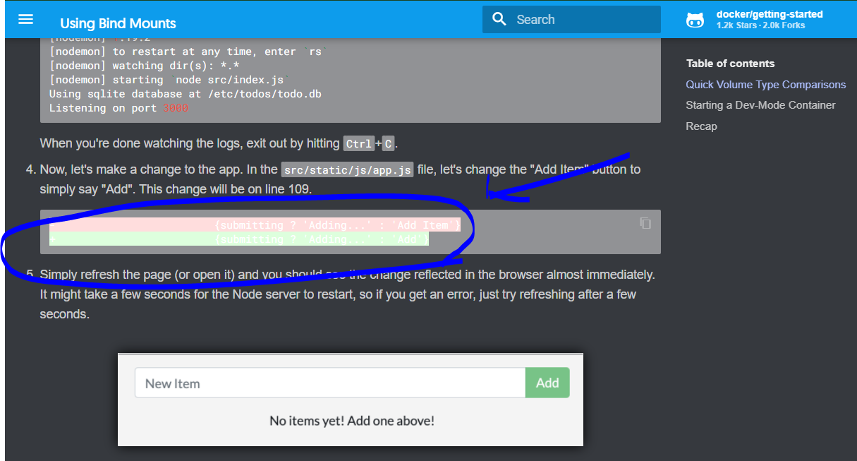
I suggest that you adjust the color, so that this text has a better contrast ratio.
As seen using inspect element, here is a simple change:
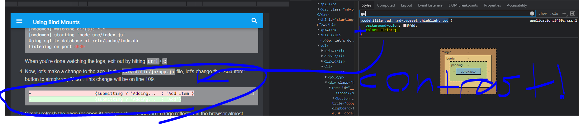
I suspect this may just be an issue with the color palette of the code in the tutorial, rather than the color scheme/palette of an actual terminal window, which may have caused this trivial inconsistency. I'm unaware if this is enough to warrant a change, or if it would ruin consistency between the color palette of the code block and that of the terminal. Regardless, this color scheming could be worked on for red/green-highlighted text. I could barely read it and it distracted me enough from focusing that I decided to make this issue.
I'm new to open source, please let me know whether this issue / request is good or unnecessary.