National and state-level google-symptoms signals are on different scales #1406
Description
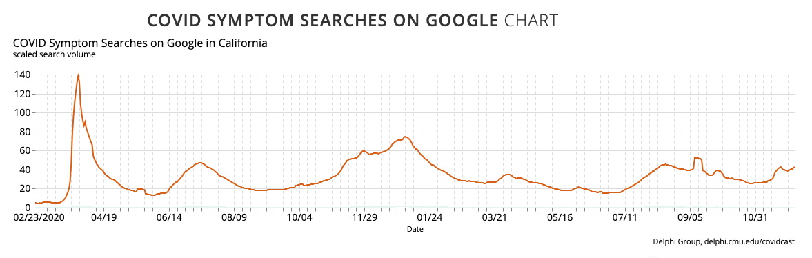
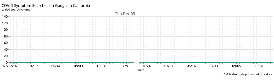
The COVID Symptom Searches on Google signal appears to be on the scale of roughly 0-100 at the national level and 0-1 at the state level. This results in very weird looking plots on the dashboard (when looking at a state, the national curve is overlaid, and makes the state curve look like it's basically at zero for all time):
@krivard @nmdefries @jingjtang: Is this just due to the way we're constructing the national signal (a bug)? Assuming so we should fix this ASAP because it's hurting the dashboard visualizations.
(Assuming not, we need to figure out a different way to visualize the national and state signals in tandem, and then I would transfer this issue over on the www-covidcast repo.).
Metadata
Metadata
Assignees
Labels
No labels