Datastripes
Data Stripes is a tool for exploring tabular multivariate datasets. Its basic idea is that correlations are easy to identify in sorted data, so it makes it easy to sort and uses a dense representation which shows you more data at once.
Try it out here
Your dataset shouldn't have more than about 2,000 rows or 30 columns. These limits are only based on screen dimensions; there are no performance issues with larger datasets. Larger monitors can accommodate larger datasets.
Your dataset should be in CSV format. The first row should contain column names.
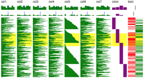
Each column is presented vertically. Data Stripes classifies each column as Numeric, Ordinal, or Boolean and uses a different representation for each.
At the top of each column is the column title. Immediately below that is an overview representation of the full dataset. Below that is an overview of the selected data, and finally below that the detailed values are represented. Each value in the column is represented by a pixel-high horizontal line.
For Numeric columns, the width of each line corresponds to the value of the data. Each column is independently scaled. The overview charts are histograms overlaid by a vertical bar indicating the position of the mean value. In the selection overview chart if the selection mean is more than 2 standard deviations distant from the overall mean, it is drawn in red. Within the detailed display, if all of the values are significantly far from zero and all have the same sign, the edge is jagged to indicate that the lines are not drawn from zero. In this way, minor differences among relatively uniform values can be perceived.
For Ordinal columns, the line is positioned depending on the value; keys are ordered alphabetically. The overview charts are histograms.
For Boolean columns, false is represented as a red line on the left and true, by a green bar on the right. In the overview there is a vertical line whose position depends on the percent true - all the way on the left for no true values, and all the way on the right for 100% true.
Click on the header of a column to sort by that column.
Drag through the rows in the detail section to select them. The selection is highlighted in yellow, and the selection overviews update while you drag.