Welcome to the Remix-Vite-Tailwind template project. This template is designed to streamline the development process with a powerful stack that includes Remix, Vite, and Tailwind CSS. The template also includes a variety of pre-built and customizable UI components that are easily integrated and adaptable for any project.
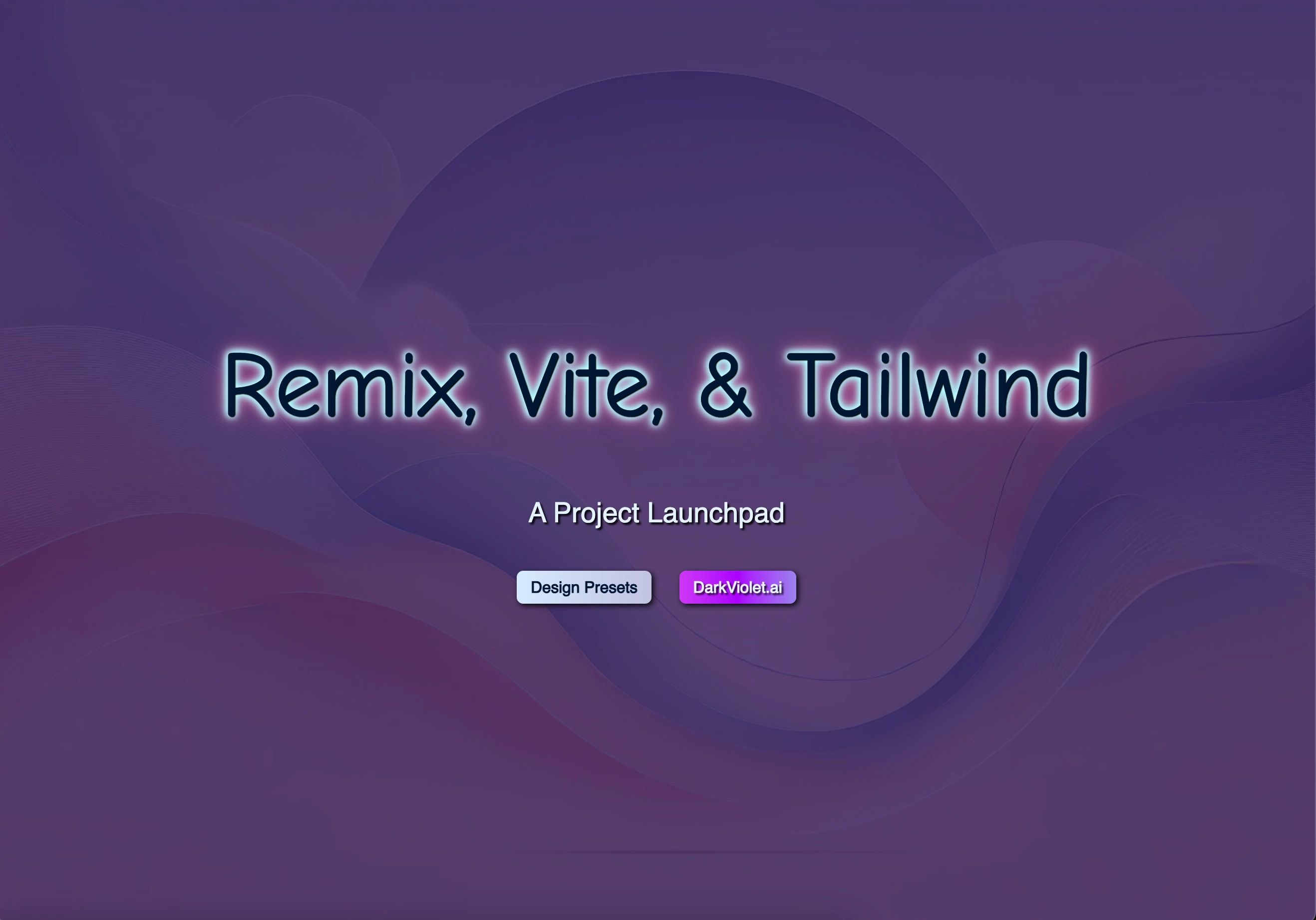
Figure 1: Remix, Vite, & Tailwind - A Project Launchpad - splash screen
- Remix for server-side rendering and routing.
- Vite for fast bundling and development builds.
- Tailwind CSS for utility-first styling.
- A collection of custom components ready for easy integration.
- Pre-configured theme with customizable colors, typography, and layout options.
- Components built with Framer Motion for animations and transitions.
- Fully responsive design and components, built with scalability in mind.
Make sure you have the following installed:
To use this template, you can quickly set up a new project using the following commands:
-
Open your terminal and run:
npx create-remix@latest --template https://github.com/EvanMarie/remix-vite-tailwind-minimal-template
-
Follow the prompts to set up your project (choose TypeScript/JavaScript, project name, etc.).
-
Navigate to your project directory:
cd your-project-name -
Install the dependencies:
yarn install
Or, if using npm:
npm install
-
Run the development server:
yarn dev
Or, if using npm:
npm run dev
-
Open your browser and go to
http://localhost:3000.
This template provides a modular and scalable structure for building Remix applications. Below is an overview of the main files and folders:
app/: The core of the Remix application.components/: Contains reusable UI components.buildingBlockComponents/: Holds all the custom design elements such as modals, buttons, accordions, etc.styles.tsx: Includes global styles, including thethemeColorsobject.tailwind.config.js: Tailwind configuration file where you can modify theme colors and settings.
public/: Static assets such as images and fonts.vite.config.js: Configuration file for Vite.package.json: Defines the project’s dependencies and scripts.
This template comes with a collection of pre-built components designed to be customizable and reusable. Some of the main components include:
- Accordion: A collapsible UI element for displaying content in sections.
- Modal: A pop-up container for dialogs or large content displays.
- Button: A customizable button component with built-in hover and active states.
- ExpandableImage: A component that displays an image in a small container with an expand icon. When clicked, the image opens in a larger modal view.
- Toast: A small, temporary notification used for feedback.
- Tooltip: Provides additional context or instructions when hovering over an element.
For a complete list of components, explore the buildingBlockComponents directory.
Each component can be easily imported and customized. For example:
import { Modal } from "./components/modal";

<Modal isOpen={true} setModalOpen={setOpen}>
  <p>Your modal content here</p>
</Modal>;
You can customize each component through props or by modifying the pre-configured styles in styles.tsx.
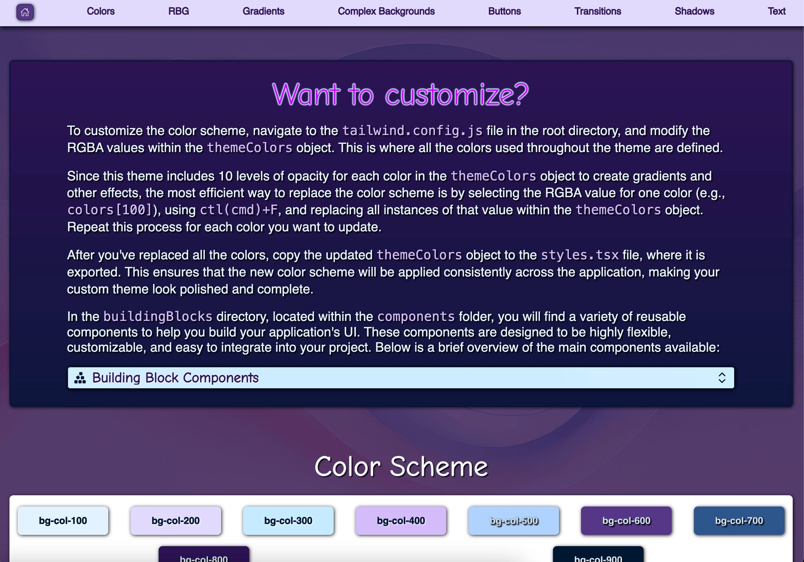
Figure 2: Remix, Vite, & Tailwind - A Project Launchpad - customizing
The template comes with a predefined color scheme, but you can easily customize it by editing the themeColors object located in tailwind.config.js.
- Open the
tailwind.config.jsfile. - Locate the
themeColorsobject. - Replace the RGBA values with your desired color scheme.
For example, to change the color for colors[100]:
themeColors: {
  100: 'rgba(255, 255, 255, 1)',
  // other colors...
}
Once you update the colors, you can easily replace all instances of a specific color in the themeColors object by using the ctl(cmd)+F function and replacing the RGBA value throughout the project.
After updating the color scheme, make sure to copy the modified themeColors object to styles.tsx for consistency throughout your application.
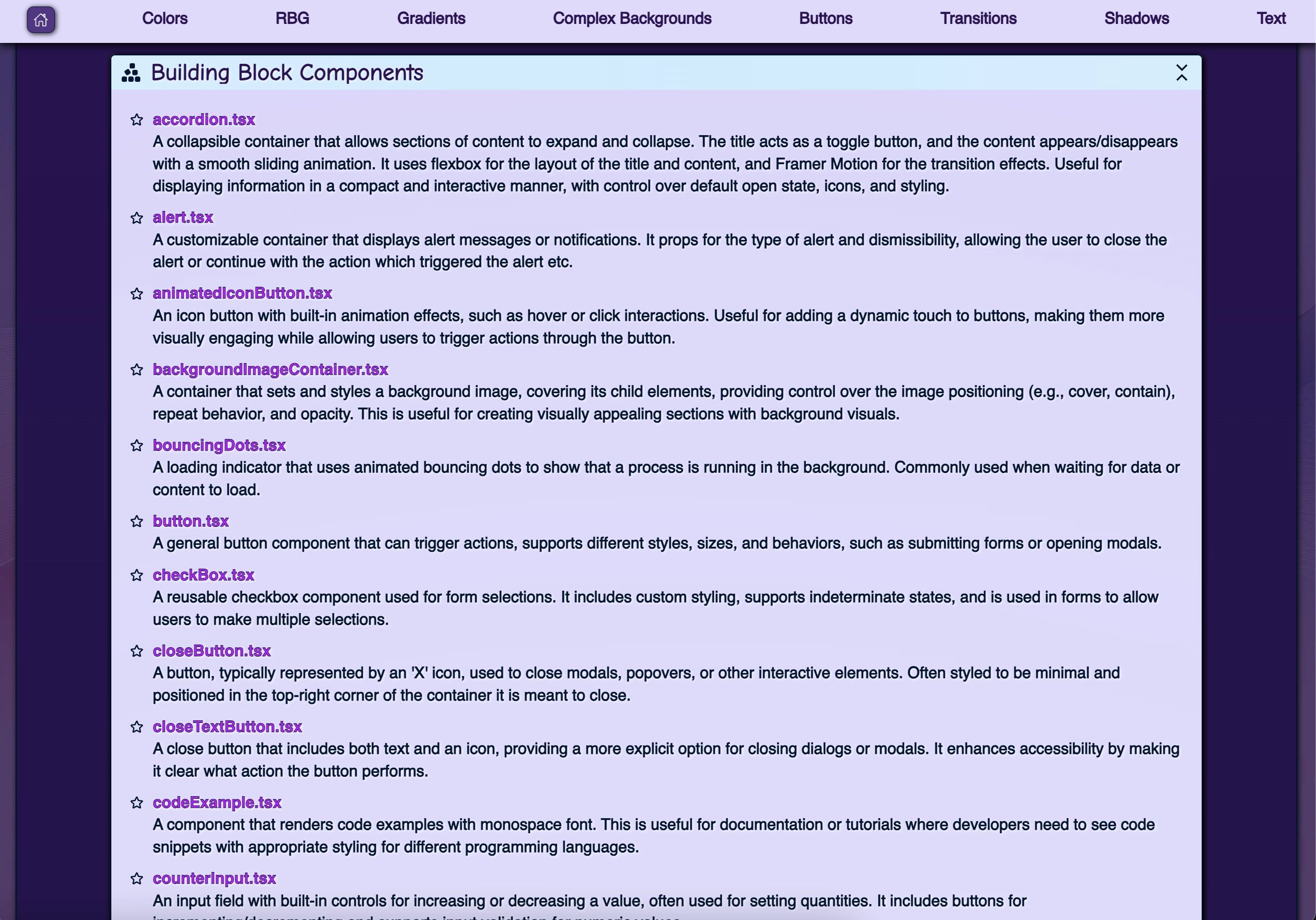
Figure 3: Remix, Vite, & Tailwind - A Project Launchpad - building block components
In the buildingBlocks directory, you will find components that are ready to use. Here’s a brief overview:
- Button: Pre-styled button component with hover and click interactions.
- ExpandableImage: Allows users to expand images in a modal for a larger view.
- Accordion: Displays content in expandable sections for easier content management.
To use these components, simply import them into your project and customize as needed.
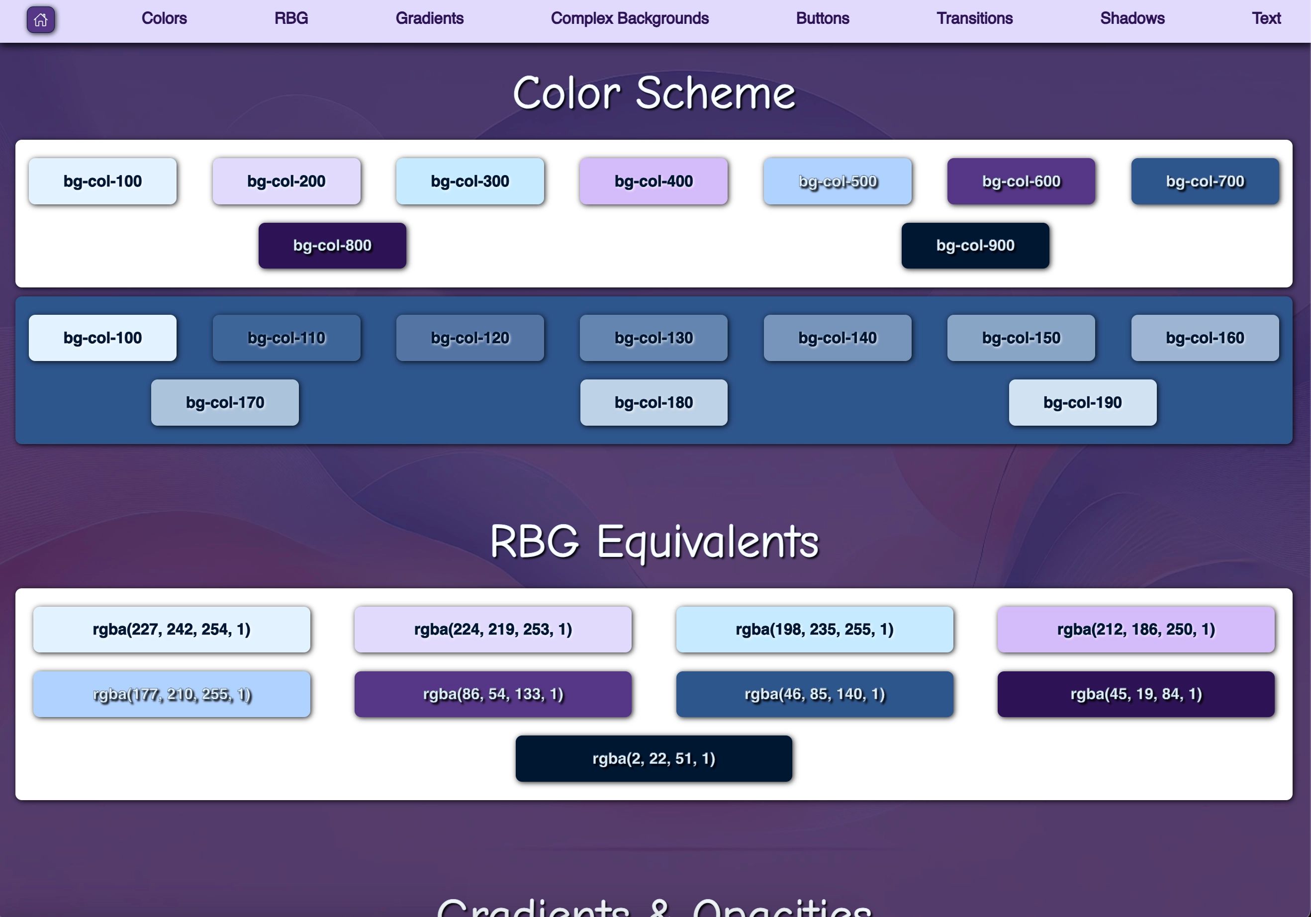
Figure 4: Remix, Vite, & Tailwind - A Project Launchpad - colors
All components are fully responsive and adjust based on the screen size. Tailwind's responsive utilities are used throughout the project to ensure that layouts work across devices. The template includes predefined breakpoints like sm, md, lg, and xl to adjust padding, margins, and layouts.
For example:
<div className="w-[20vw] md:w-[15vw] lg:w-[10vw]">Responsive container</div>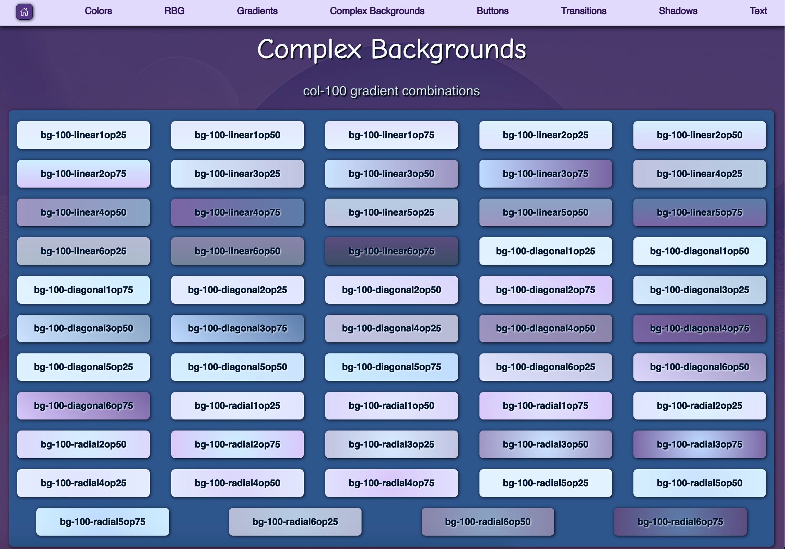
Figure 5: Remix, Vite, & Tailwind - A Project Launchpad - complex backgrounds
This template leverages Framer Motion for smooth, built-in animations. Components like the Accordion and ExpandableImage already come with animated transitions, but you can easily add motion effects to any component by wrapping elements with the motion.div or other motion tags.
Example:
<motion.div
  initial={{ opacity: 0 }}
  animate={{ opacity: 1 }}
  exit={{ opacity: 0 }}
>
  Animated content
</motion.div>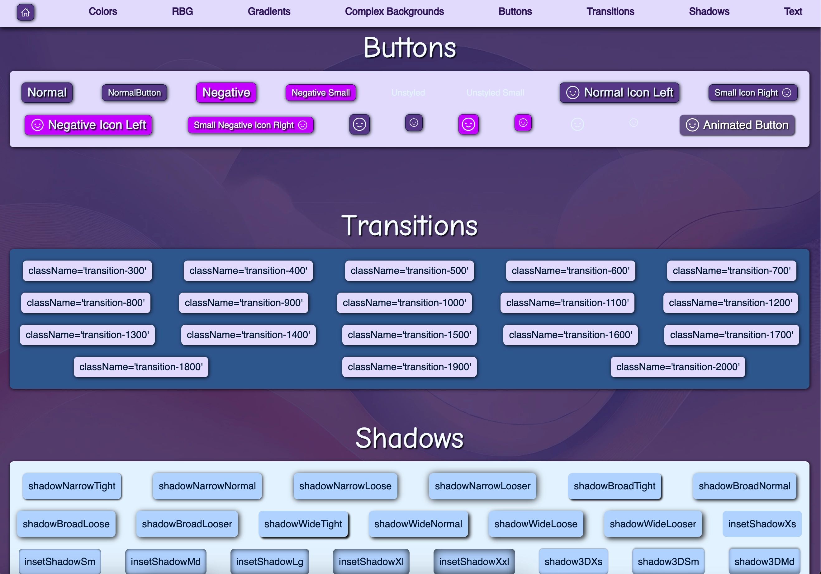
Figure 6: Remix, Vite, & Tailwind - A Project Launchpad - buttons, transitions, and text shadows
When you're ready to deploy, you can build the project by running the following command:
yarn buildOr, if using npm:
npm run buildThis will output a production-ready version of your project in the dist/ folder, optimized and ready for deployment.
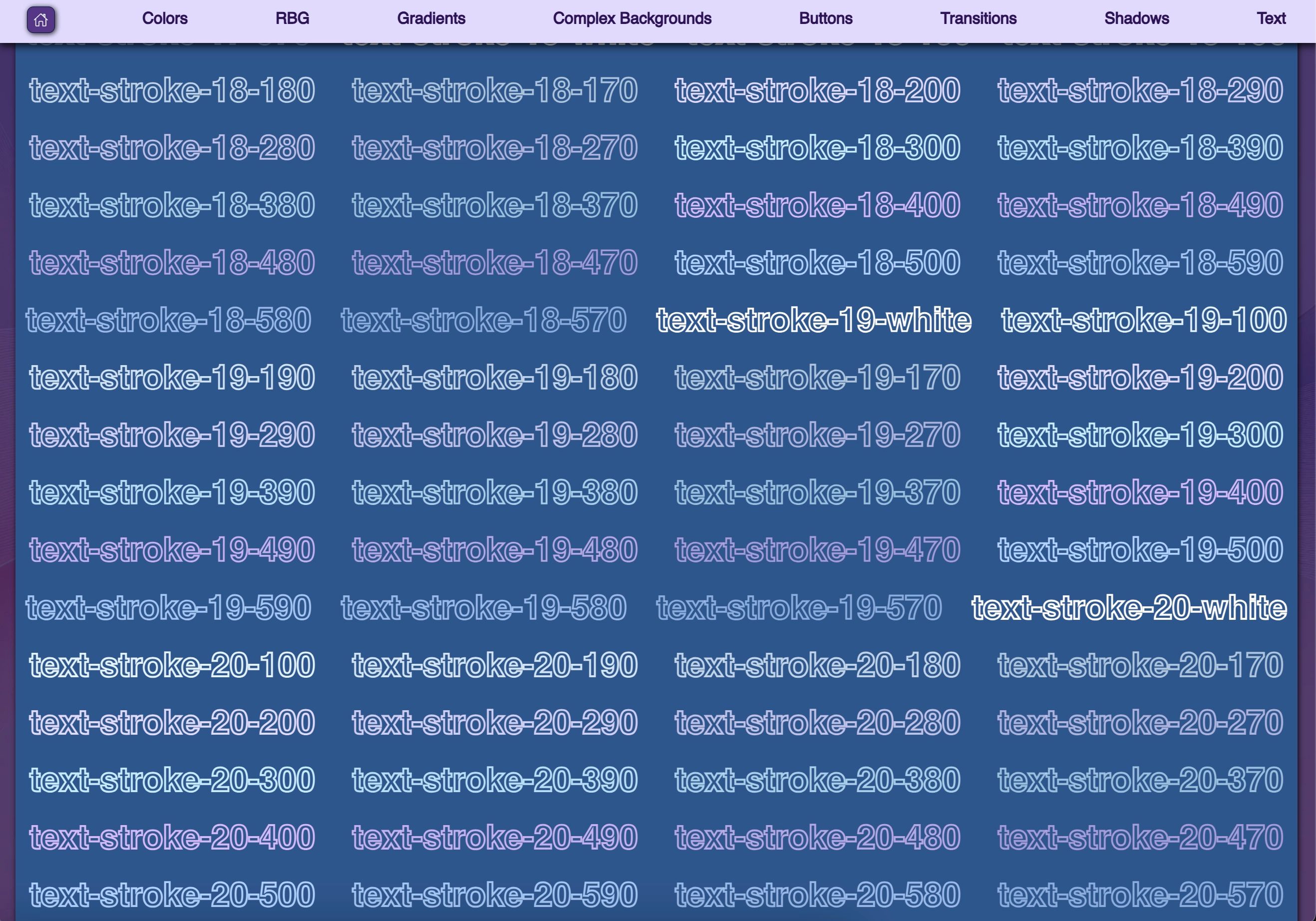
Figure 7: Remix, Vite, & Tailwind - A Project Launchpad - text strokes
This Remix-Vite-Tailwind template provides a highly customizable, modular foundation for building scalable web applications. With its collection of reusable components, flexible theming, and support for responsive design and animations, this template is a great starting point for any project.
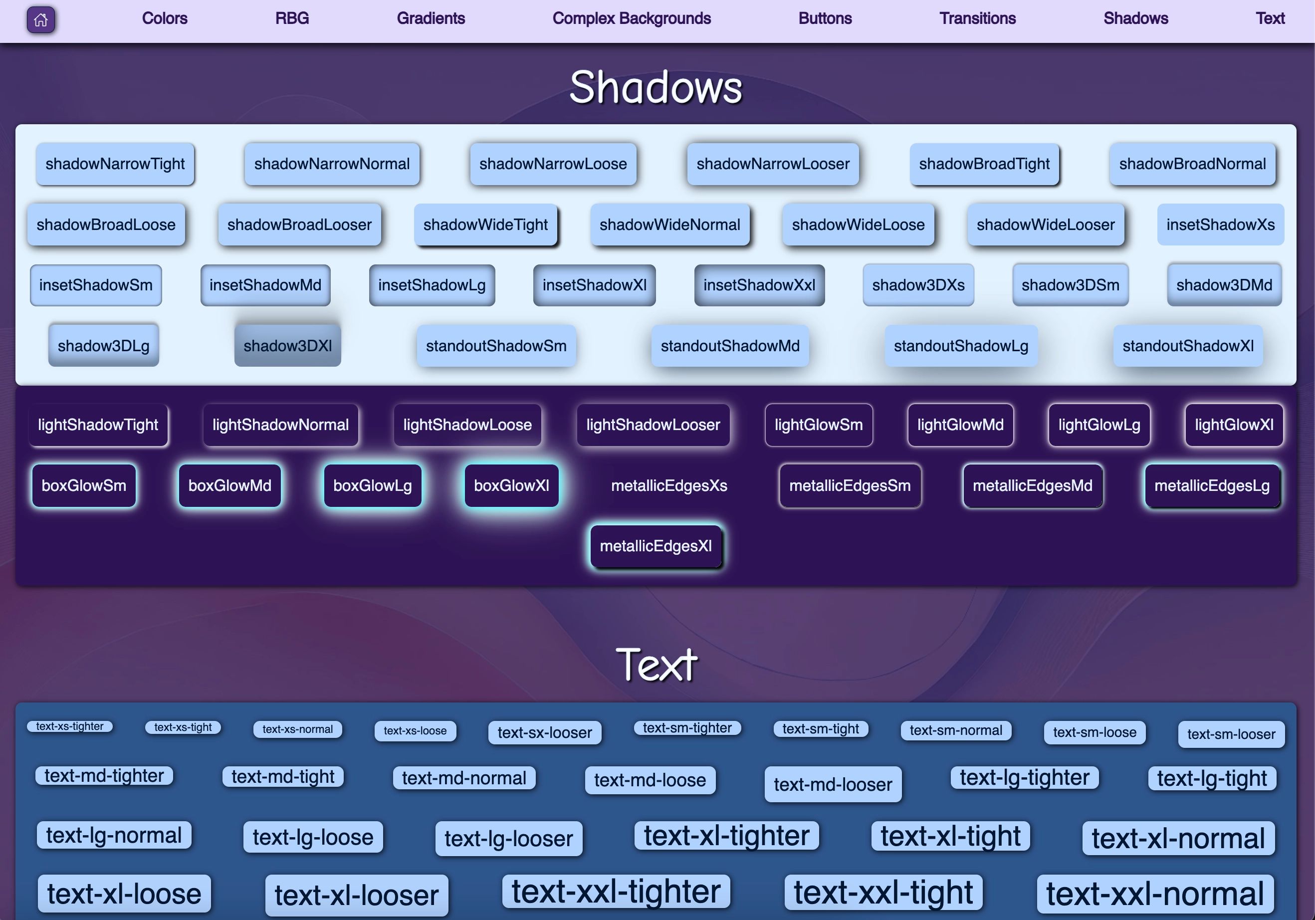
Figure 8: Remix, Vite, & Tailwind - A Project Launchpad - box shadows and text sizes
This project is licensed under the MIT License.
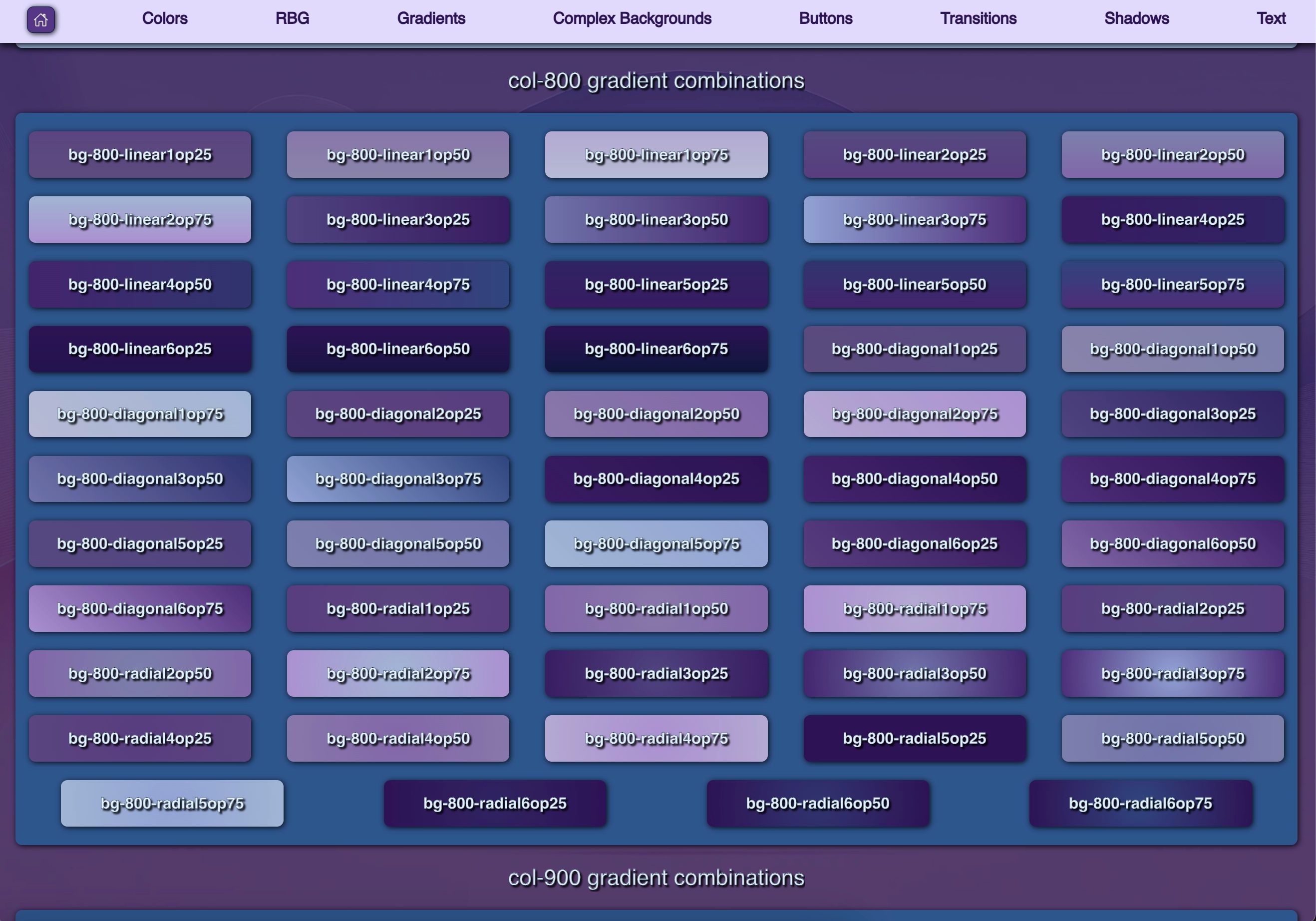
Figure 9: Remix, Vite, & Tailwind - A Project Launchpad - more background options
If you have any questions or encounter any issues, feel free to open an issue or submit a pull request on GitHub.